
Envision:
Developing AI Capabilities to Assess Soft Skills in the Workplace
The dashboard I created for the Envision product.

The Envision soft skills assessment prototype.

My Role
As the senior designer in the WorkSkills vertical in the AI Labs at ETS, I developed the Envision product with a cross-functional team consisting of UX researchers, an AI capabilities team, impact researchers, assessment designers, a learning scientist, a team of developers and a product owner. I was the only designer on the project.
This was a mid-fi prototype project where we were exploring the concept of using AI capabilities to assess soft skills for individuals in a workplace environment. It is a modular, scenario based assessment. Each module assesses three skills and a variety of sub-skills. The assessment items within a particular module center around a specific scenario. The user may choose to experience the scenario from one of three different perspectives.
As the UX/UI designer on the team I worked closely with the AI capabilities team and UX researchers during the discovery and ideation phases of the project to determine user needs and validate product features and functionality.

User Research Overview
The following user research and usability testing was conducted as part of this project. Findings were integrated into the product throughout the iterative design process.
-
Three rounds of discovery interviews with CEOs, hiring managers and human resources specialists.
-
Interviews with community college career guidance counselors and admissions specialists.
-
Concept testing with hiring managers.
-
Moderated usability testing with hiring managers. Product walkthroughs with hiring managers.
-
Codesign sessions with hiring managers.
-
Unmoderated usability testing with working professionals.
Envision Designs
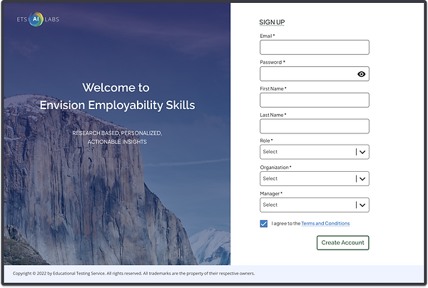
Sign In, Sign Up

The Envision Onboarding Process
A complete onboarding flow was created for this prototype. I've included the sign-up and sign-in screens here.
User feedback
-
Signing up is too cumbersome.
-
Create a simple two step process consisting of a sign-up screen with three questions and an account verification page.
.png)
The Modules Dashboard
.png)
.png)
The Modules Dashboard
The primary purpose of the Modules Dashboard is to communicate overall progress, progress on the various steps within each module, and provide the user with an entry point or a path to access each module.
The dashboard is designed to be scalable so that it can accommodate any number of modules a company chooses to purchase. The top section of the page communicates overall progress and the lower section contains a list of all the modules the user has access to. Each modules is contained within a tile. A module tile contains an image with a title, a description and a progress bar depicting each step the user has completed within the module.
The user accesses a module by selecting the Start or Continue Activity button on the module tile. When they have completed the module, the button changes to View Insights. Selecting the View Insights button will take them to the insights page where they can view their performance for the module.
User Feedback
-
The modules dashboard is laid out in a simple and intuitive fashion.
-
It provides clear, concise information about progress, and easy access to each of the modules.
-
Users particularly liked the modules graphic with the collapsible definitions, the progress bars and achievements.
Employee Insights Page
.png)
The Employee Insights Page
The purpose of the insights page is to communicate strengths and areas for improvement on the skills within a module.
-
The circle graph in the upper left hand corner provides an at-a-glance overview of performance on each of the sub-skills in a module.
-
The My Workstyle section is a brief overview, calling out the skills where the user performed the strongest.
-
The Confidence Ratings by Module provides a visual indication of self reported confidence on each of the sub-skills.
-
When selecting a tile on the Skills section grid below the content in the card to the right switches to providing a detailed performance overview for the skill.
User Feedback
We tested for user feedback on data density and accessibility of information.
-
80% of participants felt data density was "just right" 20% said "too much info"
-
The majority had no trouble locating specific information when asked.
.png)
The Modules

The Modules
When the user starts a module for the first time they are presented with the "Choose Your Experience" screen. The assessment designers wanted to create a scenario that is as relatable as possible for the test taker. To address this issue, the user may choose from the perspective of a student, a volunteer or a businessperson. This then dictates the scenario they will work their way through in the module.
User Feedback
-
The visuals are fun and engaging.
-
The scenarios are relatable.
.png)
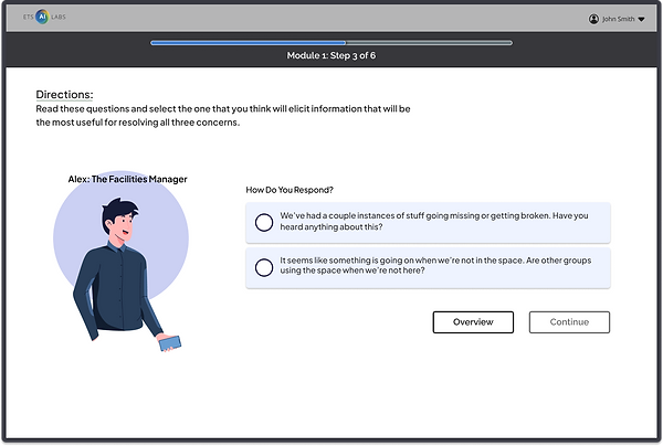
Branching
This screen demonstrates the branching that is prevalent throughout all three of the modules. Users are given multiple options or paths throughout the experience and the decisions they make on one screen will impact how the story will progress.
From a design perspective this is labor intensive. Even though there are only six steps to Module 1, twenty-five screens were created to represent all the branching options.
.png)
AI Capabilities
An important technology we are developing in the AI Labs is using AI to analyze the content of filmed sessions to gather individual performance data on communication skills.
-
The user is given a speaking prompt and is filmed while responding to the prompt.
-
The AI analyzes rate of speech, speech fluency, vocabulary usage, body posture, eye gaze, body movements and gestures.
-
We then take this data and give it back to the user in the form of performance data on the insights page.
.png)
The Module Item Types
A goal of our assessment designers was to create different test item types so that users would have variety as they worked their way through the experience. This series of screens is intended to show some of the item types that were designed for module one. They include:
Forced Choice
Written Response
Multiple Choice
.png)
The Portfolio Overview Dashboard provides an overview of all the user's accounts in their portfolio.
Primary Navigation: To address the issue of the contextual navigation being hidden in the old version of the Investor platform we decided to move it to the primary navigation at the top of the page. The Portfolio, Accounts and Groups navigation categories allow the user to view their performance, balance, risk etc. from each of those three contexts.
Tile/Widget Concept: User testing of our existing Advisor product, which utilizes the tile concept revealed that users love this approach. They reported that it is a simple and intuitive method for grouping information within the dashboard.
Dashboard Configurability: This dashboard, as well as the Accounts and Account Groups Dashboards, are fully configurable by the user. The user has the ability to choose which tiles they want to display on each dashboard and hide the tiles they don't want. A list of their hidden tiles may be accessed by clicking the three dot dropdown in the header bar at the top of the page.

Congratulations Modals

Congratulations Modals
Each module is broken up into a series of steps and sections. Each new screen is a step and sections are made up of a series of screens that make up a specific task. When a section is complete this Response Submitted modal appears. It's a way of congratulating the user on the work they have completed up to this point and giving them the option to exit.
When a module is complete the Module Completed modal displays. This notifies them that they have completed the module and congratulates them on their hard work.
User Feedback
-
The tasks within each module have been broken down into manageable chunks.
-
Users reported that they felt encouraged by the reinforcement screens.
.png)